

Marble look porcelain stoneware
Marble, a "timeless" material, and amongst the most appreciated in interior design, meets with today’s most innovative technologies to give life to a new high-performance product with a unique aesthetic impact.
Discover the porcelain surfaces for floors, walls, countertops and furniture
Marble, a "timeless" material, and amongst the most appreciated in interior design, meets with today’s most innovative technologies to give life to a new high-performance product with a unique aesthetic impact.
Marble, a "timeless" material, and amongst the most appreciated in interior design, meets with today’s most innovative technologies to give life to a new high-performance product with a unique aesthetic impact.
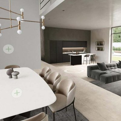
Stone-effect stoneware surfaces offer a wide versatility of use due to the availability of several different thicknesses and sizes, including large flagstones. Florim porcelain stoneware lends itself to numerous applications in indoor and outdoor environments, such as wall and floor coverings, building facades and furnishings.
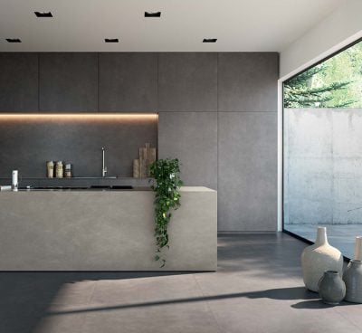
Suitable for both floors and walls, cement-effect stoneware has a modern and metropolitan soul that is suitable not only for domestic settings, but also for public and commercial spaces.
Surfaces in wood-effect porcelain stoneware are perfect for those who love the warmth and elegance of natural wood, but appreciate the durability, ease of use and high performance of porcelain stoneware.
Se preferisci puoi impostare la lingua del sito per navigarlo in russo
Vai al russo Chiudi / CloseSi prefieres, puedes configurar el idioma del sitio para navegar en español
Ir a la versión en español Chiudi / CloseSi vous préférez, vous pouvez configurer la langue du site pour naviguer en français
Aller sur la version française Chiudi / CloseIf you prefer, you can set the website language to browse it in English
Go to the English version Chiudi / CloseSe preferisci puoi impostare la lingua del sito per navigarlo in italiano. Invece, per continuare sul sito inglese clicca sul pulsante chiudi.
Italiano Chiudi / Close